Simplicity vs. Detail: Dashboard Design Explained
Learn how to design effective dashboards by balancing simplicity and detail for different user needs, ensuring clarity and actionable insights.
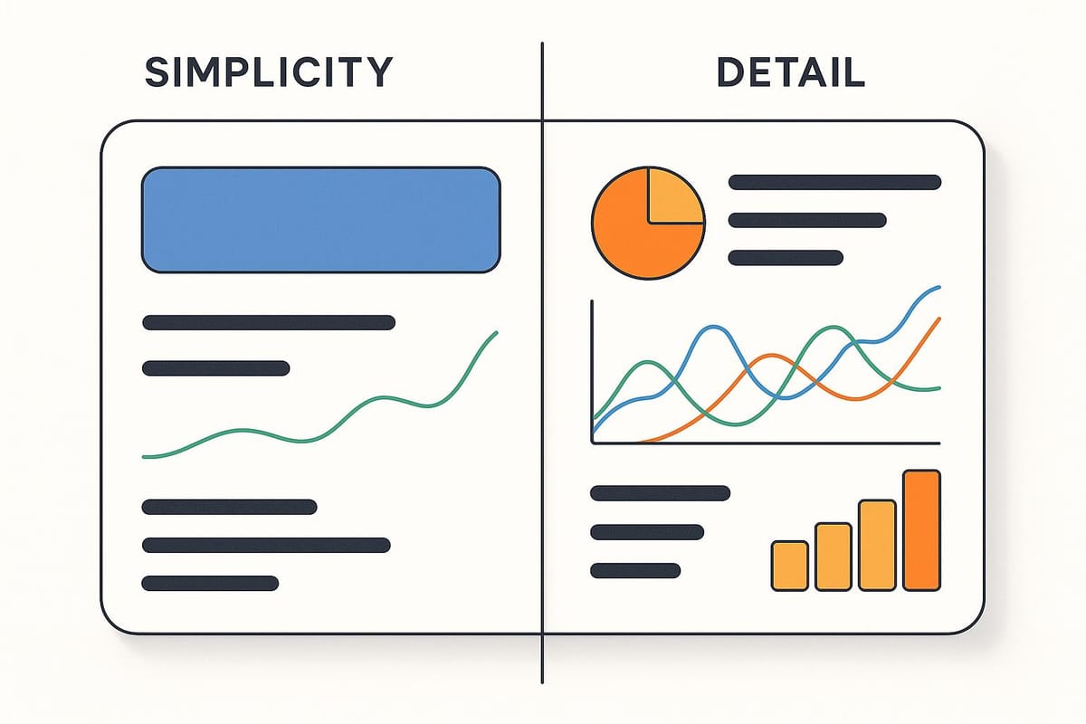
Dashboard design is all about turning raw data into insights that users can act on quickly. The key challenge? Balancing simplicity for easy understanding with enough detail for deeper analysis. Here's the breakdown:
- Simple dashboards are great for quick decisions. They focus on essential metrics, avoid clutter, and are best for executives or non-technical users.
- Detailed dashboards dive into granular data, helping analysts or technical users investigate trends, troubleshoot, or explore complex datasets.
The right choice depends on your audience and goals. Simple dashboards work for high-level overviews, while detailed ones are better for in-depth analysis. The best designs often combine both through features like filters, drill-downs, and customizable views.
| Aspect | Simplicity | Detail |
|---|---|---|
| Usability | Easy for most users; no technical skills needed | Requires expertise; more complex to navigate |
| Decision Speed | Faster due to focus on key metrics | Slower; involves exploring detailed data |
| Audience | Executives, managers, non-technical users | Analysts, IT teams, technical users |
| Risk of Overload | Low; avoids unnecessary information | Higher; needs careful organization to avoid clutter |
Balancing simplicity and detail ensures dashboards meet diverse user needs while staying clear and functional.
How to Build Great Dashboards (5 Principles)
Simplicity in Dashboard Design
Creating a simple dashboard is all about clarity - making data easy to understand and immediately actionable. By stripping away unnecessary elements, you can focus attention on the key metrics that matter, ensuring users can grasp insights at a glance and act without hesitation.
Core Principles of Simple Design
The backbone of a simple dashboard is minimalism. This means removing anything that doesn’t directly serve the user’s needs. Decorative graphics, excessive colors, and redundant information? They only add clutter. Instead, prioritize clean, purposeful design.
A clear visual hierarchy is essential. Place the most critical metrics in the top-left corner (where attention naturally starts), and use size, color, and positioning strategically to guide the user’s focus. Typography should be easy to read and free of jargon or industry acronyms so even non-technical users can navigate effortlessly.
Don’t underestimate the power of white space. Leaving room around data elements reduces visual noise and makes the information easier to digest. Crowding every inch of the screen only overwhelms users and diminishes clarity.
Another key principle is the data-ink ratio. This approach emphasizes using visual elements exclusively for conveying data, eliminating anything decorative. Every line, color, or graphic should serve a purpose - if it doesn’t, it doesn’t belong.
Benefits of Simple Dashboards
Simple dashboards bring real advantages, starting with speed. Users can make decisions faster because they’re not wasting time deciphering cluttered layouts. Research from Isadora Digital Agency even found that dashboards with fewer than seven visual elements are interpreted 40% faster than more complex designs.
Accessibility is another win. By removing complexity, simple dashboards empower non-technical users to engage with data. For example, a marketing manager can quickly see whether a campaign is performing well or poorly without needing to dive into advanced analytics.
Reducing cognitive load is also a major perk. When users can scan and understand data quickly, they experience less mental fatigue. This leads to better engagement and ensures that teams adopt the dashboard consistently.
Maintenance becomes easier too. With fewer elements, there are fewer things that can break. Updates are quicker to implement, and new users can be trained without having to navigate a complicated interface. A 2023 survey by UXPin revealed that over 70% of business users prefer dashboards that feature just three to five key metrics on the main screen, with deeper details accessible through filters or drill-downs.
When to Use Simple Dashboards
Simple dashboards shine in situations where clarity and speed are essential.
Executive-level reporting is one such scenario. C-suite leaders don’t need granular details - they need a high-level overview for strategic decision-making. For example, a CEO’s dashboard might focus on revenue growth, profit margins, and customer satisfaction scores, offering a quick snapshot of the company’s health.
Daily operational checks also benefit from simplicity. A retail store manager, for instance, might rely on a dashboard to quickly review yesterday’s sales, current inventory levels, and any urgent issues. Without a simple design, these critical insights could get buried in unnecessary complexity. One case study even demonstrated how a utility company reduced incident response times by 20% by implementing a dashboard with just three core metrics: system uptime, incident count, and average response time.
Simplicity is equally important in presentations and stakeholder meetings. A straightforward dashboard ensures everyone can follow along and engage with the data, avoiding the confusion that complex designs often cause.
For customer-facing dashboards, simplicity builds trust. Whether you’re presenting campaign performance or account insights, your customers shouldn’t need special training to understand their own data. Progressive disclosure - showing essential metrics upfront and deeper details on demand - works particularly well here.
Finally, mobile dashboards demand simplicity. With limited screen space and touch-based navigation, overly complex layouts can frustrate users. Simple designs, on the other hand, translate seamlessly to mobile devices, delivering insights on the go without the headache.
Next, we’ll explore how detailed design techniques come into play when deeper analysis is required.
Detail in Dashboard Design
While simplicity emphasizes clarity, detailed dashboard design takes a different route - focusing on comprehensive data coverage and granular insights. These dashboards are tailored for users who need to go beyond surface-level metrics to uncover the full story behind the data. Rather than replacing simplicity, detailed dashboards complement it by offering the depth required for technical and operational insights.
These dashboards don’t just highlight what’s happening - they dive into why it’s happening. They’re essential for tasks like root-cause analysis, thorough investigations, or whenever technical expertise demands access to raw data points.
Core Principles of Detailed Design
Detailed dashboards embrace the complexity of real-world data by layering information in a structured way. They incorporate multiple metrics, historical trends, and segmented views, allowing users to analyze information from various angles. This layered approach makes it possible to manage complexity without overwhelming the user.
A key component here is layered information architecture. By organizing data into logical hierarchies, detailed dashboards use expandable sections, tabs, and drill-down options to keep things accessible. This structure ensures users can seamlessly move from high-level overviews to specific data points.
Another critical concept is progressive disclosure. This method gradually reveals additional layers of data, allowing users to explore deeper insights only when necessary. It strikes a balance between usability and access to granular details.
Visual hierarchy plays a slightly different role in detailed dashboards. Instead of presenting all the details upfront, they rely on logical grouping and consistent visual cues to guide users through complex datasets. Related metrics are clustered together, while interactive elements like filters and tooltips provide extra context without cluttering the interface.
Benefits of Detailed Dashboards
Detailed dashboards shine in contexts where complex decision-making is key. According to a 2023 survey by Dresner Advisory Services, 68% of organizations reported that detailed dashboards significantly improved their ability to make data-driven decisions, particularly in technical and analytical roles.
Features like drill-down capabilities make these dashboards ideal for root-cause analysis, offering a level of depth that simple designs simply can’t match. This is especially valuable when decisions require more context and precision.
Another major advantage is the ability to provide customized insights for technical users. Professionals like data analysts, IT specialists, and engineers often need access to raw data, error logs, and detailed performance metrics. For them, this level of detail is not overwhelming - it’s essential. A 2022 Gartner study revealed that organizations using detailed dashboards for operational monitoring reduced incident response times by 25% compared to those relying on high-level summaries.
Detailed dashboards also support hypothesis testing and pattern recognition. By applying filters, comparing time periods, and analyzing correlations, users can uncover insights that might remain hidden in simpler views.
In addition, these dashboards excel at monitoring multiple KPIs simultaneously. While simple dashboards often focus on a handful of key metrics, detailed dashboards can present dozens of related measurements, providing a comprehensive view of system performance or business operations.
When to Use Detailed Dashboards
Detailed dashboards are most effective in scenarios where deep technical insights are required.
- IT system monitoring: System administrators need real-time access to server performance, error rates, resource utilization, and log data. High-level summaries won’t cut it when troubleshooting network issues or preventing system failures.
- Financial performance analysis: Finance teams often need to dive into revenue by account, track departmental expenses, and analyze profitability at a granular level. Detailed dashboards help meet compliance requirements and support strategic planning.
- Manufacturing quality control: Production managers rely on detailed dashboards to monitor defect rates, machine performance, and material usage. For example, Kaiser Permanente implemented a dashboard to track patient outcomes and operational efficiency. Over six months, they saw a 20% improvement in operational efficiency and a 15% reduction in patient wait times.
- Research and development: Scientists and engineers need dashboards that can track experiment results, testing parameters, and performance metrics across multiple variables. This comprehensive data access is vital for validating hypotheses and optimizing processes.
- Advanced marketing analytics: While executives may prefer simple campaign summaries, marketing analysts benefit from detailed dashboards that show conversion funnels, audience segments, and channel attribution. This granular view enables optimization strategies that go beyond surface-level metrics.
The shift from simple to detailed dashboard design reflects the growing complexity of data analysis needs across industries. The challenge lies in striking the right balance between simplicity and depth, ensuring that dashboards remain both accessible and insightful.
Simplicity vs. Detail: Direct Comparison
Deciding between simplicity and detail in dashboards often comes down to how they perform across key metrics. The choice isn't always black and white - what works for one team might fall flat for another.
Side-by-Side Comparison
The differences between simple and detailed dashboards become clear when you compare their strengths and weaknesses in critical areas:
| Aspect | Simplicity | Detail |
|---|---|---|
| Usability | Easy for most users; intuitive navigation with minimal effort | Challenging for non-technical users; requires specialized knowledge |
| Decision Speed | Quick decisions due to reduced mental effort and instant visibility of key data | Slower; involves time-consuming exploration and analysis |
| Audience Suitability | Broad appeal; great for executives, managers, and casual users | Narrower audience; ideal for analysts, data scientists, and technical users |
| Risk of Information Overload | Low risk; focuses on essential metrics only | High risk without careful organization and design |
| Customization Options | Limited; offers standardized views with little flexibility | Extensive; allows deep customization, filtering, and exploration |
| Maintenance Requirements | Simple to maintain; fewer elements to update regularly | Complex; demands ongoing data management and validation |
This comparison highlights that neither approach is universally better - it all depends on your specific needs.
Simple dashboards excel at delivering quick, actionable insights, making them perfect for users who need to process information rapidly. On the other hand, detailed dashboards provide the depth necessary for in-depth analysis but can overwhelm users who aren't ready for that level of complexity.
Factors That Influence Your Choice
Several key factors can help you decide between simplicity and detail, including your audience, time constraints, usage patterns, and organizational needs.
Audience expertise plays a major role. Analysts and technical teams often need detailed dashboards to dig into data, troubleshoot issues, and validate hypotheses. In contrast, non-technical users or executives benefit more from simple dashboards that highlight only the most important metrics.
When time sensitivity is critical - like monitoring system alerts or tracking daily sales - simplicity shines by enabling quick decision-making. For deeper investigations, detailed dashboards are better suited to the task.
Usage frequency is another consideration. Users who check dashboards multiple times a day prefer streamlined designs that provide instant clarity. Meanwhile, those who use dashboards for in-depth analysis on a less frequent basis can handle more complexity.
The context of use also matters. For example, a dashboard displayed on a large screen in a meeting room has different design needs compared to one accessed on a mobile device during a commute. Simple dashboards tend to adapt better to varying screen sizes and conditions.
Compliance requirements can tip the scales as well. Industries like finance, healthcare, and manufacturing often require detailed reporting and data trails - features that simple dashboards may not fully support.
Lastly, organizational culture and the state of your data infrastructure can guide your choice. Companies that prioritize quick decisions and agility often lean toward simple dashboards, while those with a strong focus on analytics may prefer detailed designs. Simple dashboards work best when your data is clean and KPIs are clearly defined. Detailed dashboards, on the other hand, demand robust infrastructure and strong data quality controls.
These factors provide a framework for balancing simplicity and detail, setting the stage for further exploration in the next section.
How to Balance Simplicity and Detail
Creating dashboards that balance simplicity with detail requires a thoughtful approach, ensuring they address the varied needs of users. The secret lies in designing layers of information that users can interact with, tailored to their expertise and specific requirements.
Methods to Balance Both Approaches
One of the most effective ways to strike this balance is through progressive disclosure. This technique integrates high-level summaries with detailed data within a single interface. For instance, a sales dashboard might display total revenue prominently on the main view, while allowing users to click or hover to explore regional or product-level details. This way, the interface remains clean, yet detailed information is just a click away.
Interactive filters elevate static dashboards into dynamic tools. These filters allow users to adjust views based on specific time frames, categories, or data segments. Combined with drill-down functionality, users can move seamlessly from summaries to granular data. For example, a financial dashboard might let users filter by fiscal quarters or departments, then click on overall expenses to uncover department-level spending and even individual line items.
Customizable views offer another layer of personalization, enabling users to adapt dashboards to their roles. For example, a marketing dashboard might provide different layouts for campaign managers, content creators, and executives. Each layout emphasizes metrics relevant to that role while keeping additional data accessible via tabs or expandable sections.
Tooltips and expandable sections are excellent for preserving screen space while offering detailed insights on demand. Hovering over a chart point can reveal specific values or trends, while expandable sections allow users to uncover supporting data only when needed.
These interactive elements ensure dashboards remain intuitive and user-friendly, providing depth without overwhelming users.
Dashboard Design Best Practices
Beyond interactive features, strong visual design is essential for balancing simplicity with detail. Choosing the right visualizations for each metric can make or break the user experience:
- Line charts are ideal for showcasing trends over time, such as tracking revenue or monitoring performance.
- Bar charts excel at comparing categories, like regional sales or departmental budgets.
- Pie charts work well for composition data but should be limited to a few segments to avoid clutter.
- Tables are best for presenting detailed data but should complement summary visualizations, not dominate the dashboard.
A clear visual hierarchy is vital for guiding users through the information. Use size, color, and placement to highlight critical metrics. For instance, place primary KPIs in prominent locations, use bold colors for alerts, and group related data with consistent spacing.
Whitespace and margins are often overlooked but play a major role in readability. Generous margins around elements reduce visual noise and make information easier to process. This approach ensures that even detailed dashboards feel organized and accessible.
Consistency in design also reduces cognitive load. Use the same colors for similar data types across charts, stick to uniform fonts and sizes, and maintain consistent spacing throughout. Familiar patterns help users focus on the data without getting distracted by the interface.
Lastly, clear and descriptive labeling is crucial. Avoid technical jargon or abbreviations that might confuse users. Include units of measurement, time periods, and any necessary context. Well-crafted labels not only build trust but also enable faster decision-making.
Learning Dashboard Design Skills
To master the art of balancing simplicity with detail, consider diving into dashboard design courses. Platforms like Upskillist offer practical, hands-on training that focuses on real-world applications. These courses teach essential principles, from understanding user needs to implementing progressive disclosure techniques.
Through interactive exercises and expert feedback, learners gain experience in selecting the right visualizations, creating effective filters, and designing intuitive navigation systems. For example, students might practice building dashboards that cater to both executive overviews and analyst-level deep dives. These projects simulate workplace scenarios, preparing learners to meet diverse stakeholder demands.
Additionally, the courses emphasize accessibility standards, ensuring dashboards are usable for everyone, regardless of technical skills or physical abilities. This includes features like high-contrast colors, descriptive text, and interactive elements that comply with U.S. accessibility standards, such as Section 508.
Conclusion
Crafting the perfect dashboard isn’t about choosing simplicity over detail or vice versa - it’s about tailoring the design to meet the needs of its users.
The key lies in customization. Executives often require quick, high-level summaries to make swift decisions, whereas analysts need access to detailed, granular data for deeper analysis. For instance, a retail sales dashboard might highlight total sales, top-performing products, and regional trends at a glance, while still allowing users to drill down into specifics like individual store performance, time periods, or customer demographics for further insights.
Incorporating features like interactive filters, tooltips, and expandable sections ensures dashboards can cater to both broad overviews and detailed investigations. These tools bridge the gap, making it possible to switch seamlessly between quick decision-making and comprehensive analysis.
Dashboard design is not static - it evolves alongside shifting business objectives, user expectations, and technological advancements. Regular user feedback, analytics, and updates are essential to keep dashboards effective and relevant. Edward Tufte’s data-ink ratio principle remains a valuable guide: focus on maximizing visual elements that convey meaningful data while minimizing unnecessary graphics.
Start with user research, establish a clear hierarchy, and conduct real-world testing. Pair this foundation with accessibility standards and consistent design practices to create dashboards that are not only visually appealing but also highly functional. This structured approach ensures a balance between simplicity and detail, turning raw data into actionable insights.
FAQs
How do I decide between a simple or detailed dashboard for my audience?
Choosing the right type of dashboard - simple or detailed - hinges on understanding your audience and their specific needs. A simple dashboard is perfect for those who need quick, high-level insights or may not be deeply familiar with the data. Its straightforward design helps convey essential information without overwhelming the user.
In contrast, a detailed dashboard caters to users who require in-depth analysis and are comfortable navigating more complex data. This option offers granular details that support deeper exploration and decision-making.
To decide which approach works best, think about your audience's goals, expertise, and how often they’ll use the dashboard. Gathering user feedback can also help fine-tune the balance between simplicity and depth over time.
How can I effectively balance simplicity and detail in dashboard design?
Creating a dashboard that strikes the right balance between simplicity and detail starts with understanding your audience. Identify what metrics they need most and ensure those insights are front and center. The goal is to present key information clearly while still offering the ability to dive deeper into the data when needed.
Use visual hierarchy to guide the viewer's focus. Place the most important information in prominent positions, and leverage charts or graphs to make complex data easier to grasp. Avoid clutter by removing unnecessary elements, keeping the design clean and straightforward. Consistency in colors, fonts, and layouts is also key to making the dashboard intuitive and easy to navigate. This way, you create a tool that’s both practical and visually engaging.
What is progressive disclosure, and how can it help balance simplicity and detail in dashboard design?
Progressive disclosure is a design principle that focuses on showing only the most critical information upfront, while enabling users to dive into additional details if they choose. This method keeps dashboards clean, uncluttered, and easy to navigate, ensuring users aren't overwhelmed with too much data at once.
By emphasizing simplicity in the initial view and providing deeper insights through interactive features like tooltips, dropdown menus, or expandable sections, progressive disclosure allows users to concentrate on the most relevant information. At the same time, it ensures that more detailed data is readily accessible when needed. This approach strikes a balance between usability and functionality, making dashboards both intuitive and powerful.